Idea Development – Banners / Mini map / Arena / Broadcast HUD

This is a checkpoint blog for my Geographical Section which includes the final ideas for my Mini map / Arena / Broadcasting HUD and Banner. This will allow those looking at my work to see what I have researched before and funnel it into a single blog of clear cut answers of where that work has gone.

MINi map

This was a small addition to research into as the idea of the Mini map was to create a simple blueprint of the full map with the Icons placed onto them to show how the viewers would see them in a match when looking out for there favourite ‘player’. To this end I used a single blog into the codes of map creation for the genre and explained that I would create a small radar version in the style of a blueprint. This will mainly be featured in my Broadcasting HUD but I felt it a important part to look into regardless.

In full, I will be creating a small simple version of the map which will act as a little radar for in world viewers. It will also show my understanding of Map creation.

Arena

When it came to creating a Arena, I knew that I would not be designing the whole arena in a 360 style design and instead I decided that the best way to show my Arena and its features without having to create a humongous wall of art is to create a image from the point of view of a viewer sat inside the Arena and annotate each part so that the people looking at the picture can identify the different places. This style allows me to create a snap into the world while also giving me more time to focus on the harder parts of my designing such as my Character art.

So to be clear, I will creating a photo like image of the Arena from the position of someone sat in the crowd, this will include the Banners, crowd, the broadcasting screens and anything else needed inside of the Arena. However, I will annotate it when it is placed on the Wix Site due to the compactness of the image that I foresee.

Broadcast HUD

This is a vital part to my section that took the majority of the research. This HUD will be what the viewers see when watching the games on screen, exactly the same as the visuals we see in today’s esports as well as today’s football games with the use of scorelines giving watchers information even if they miss the first part. With this in mind I looked at many different styles and once I found the one that suited best, I looked into how I would strip away the useless information to replace with more interesting and pressing information.

To this end, I will create a HUD that includes a top bar that will show a timer in the middle showing the minutes played while just underneath I will display the team score, on either side I will have the icons of each player and at the end of each sides line I will display the icon of their nation respectively. At the Bottom Bar I will show individual stats of who the commentators choose to view which will display their icon at the bottom alongside their name and stats ( Deaths / kills / assists ) similar to how a game shows stats in most modern games.

banners

These are basically flags that will help people see who stands for whose nation. This will also be used in the colour schemes of the players icons to show viewers there team while looking at the radar while the whole icon will be alongside them when looking at the HUD. It is also a creative way to show the feelings and the emotions of the people who reside there and the personality that I am trying to build for the nations as a whole. This will be shown with colour choice and animal iconography.

I will creating four banners, one for each nation. The East will be Yellow and Owl. The West will be Shark and Red. The South will be Snake and Purple. The North will be Black and Crow.

moving forward….

With these four pieces placed in a clear cut view allowing for myself to be able to instantly catch up on what it is I need to create so that when it comes to practical I can move straight on. With the character section complete and the Geo now finished I can now move on to the final section of research, Website. This will include Title research and Website presentation research. After this I intend to complete the Pre Production documents before moving on to the practical work.

Concept Research – Colours for Banners

This next piece of research is to make sure that I can effectively create banners that somewhat reflect the animals they use while also reflecting the ideology of the nation. With my work I have chosen to create four nation and therefore require 4 colours to suit each.

The East nation is that of a smart like people that put the brain in front of brawn. As such the animal I ended up finding to be the best was the Owl, a wise creature by symbolism and nature. To suit this creature and nation I must find a colour that represents both a level of intelligence and also joy due to their nice peaceful attitude.

The West nation is that of a strength first learning later quota. They hold power above all over attributes and as such have become a rather simple minded people who hold a bully like complex in their minds. The animal that was chosen to represent was the Shark. This is due to the sharks ability to hone in on blood making sure that its targets are already weak and therefore bullying them to death in a less fatal sense. The colour therefore must be that which shows strength and an overall predator feel to them.

The South nation is seen as the big baddies. The main bullies in this world that use the others to get to the north. As such the South is a smart controlling like people that manipulate the kind hearted people of the East and the idiotic West. This smart nature allows them to bully the north and show dominance and therefore to show this I will need a colour that signifies cunning and evil.

Finally, the North. These are the ‘good guys’ as they are where our characters are from. This was a prideful nation who reigned as friendly number ones until the South pulled the rug on which they stood. They now are poor, run down and vengeful. Hated by all for no reason which further pushes this violent emotion outwards. The animal I choose to represent this was a crow, the bad omen bird that signifies coming danger. Therefore I must choose a colour that shows this cold vengeance while also showing the grief in which these people live under.

In a previous blog I went in depth on the psychology of colours, and with this understanding I can effectively choose two colour for each nations banner and then allow the audience to decide in which one they prefer. To start I will explain the choices of the Northern nation.

I feel that the best two colours that could effectively show the aspects I wish to display would be cobalt blue and black. Black is the obvious go to when wanting to show grief, it allows me to play with a traditional evil colour and turn it to a more mournful one. This is the more simple choice out of the two but due to it then making the banner invert colours, making so the animal be in white not black, it allows for the north to make that perfect standing out feel. The second choice, cobalt blue, is more in reference to the actual reality of the North and their emotions. The dark blue which cobalt effectively shows helps build this bridge with the ice element that in turn helps show the hardened people of the North while keeping this dark vengeful view with the use of the crow.

Next we have the Eastern nation, represented by the owl. The choices for this side of the world would be Yellow and Purple. Purple is the intellectual colour that shows a level of pride as well, this plays in very well with the best attribute being the intelligence of their people. Purple also allows us to see a excited more giddy style, this helps to fuel this idea of them having this child like care while also keeping their wits about them. The second choice is Yellow, this colour is bright and acts as a beacon of child friendly joy, its pours out joy and happiness. This colour also helps us think of cartoon like electricity which can helps us build the bridge of a smart race of people due to them having the greatest technological advancements, fuelled by electricity.

Next is the predator like people of the West. Red is the only choice. This one is decided without a vote and I will explain now why I have made this choice. The colour of Red is the universal bad guy colour. It is used in gaming as the age old colour to identify enemies on a mini map and enemy names are usually highlighted in Red. Not only does it show this evil nature to the West, it also fits the Shark perfectly, the idea that the shark chases its prey from the weakness that they show after losing blood allows me to play this idea off in their nations banner. This is a no brain – er choice for me and I believe that people can understand why I use this colour and why nothing else could really match up to it.

Finally, the big baddies, the South nation. Purple and Orange. Orange is the colour that signifies fire, this in turn helps us see this nation as a ravaging force that consumes anything in its way. It also helps build the dominance of the South similar to how a fire will burn anything it can touch indiscriminately and that it will also assimilate anything that can help spread its flames like the Souths bullying mentality. Purple, similar to how I explained it for the East, shows the intelligence of its bearer but also helps in another way that further pushes the souths agenda. Purple is a naturally mysterious, villainous colour that many shows and media outlets use to express evil natures. These two aspects mix and purple starts to show this dark yet smart mystic vibe.

With all these listed out I intend on creating a short questionnaire to get the feedback I need for making these banners. After this I will be able to create a weekly reflection on what I had done and what I intend to do next.

Theoretical Awareness – MOBA maps

As well as the Broadcasting HUD / Banner / Arena. I must also make sure that I can design a radar looking like mao that follows the codes of the actual MOBA standards. To clear up confusion around the keywords I will also make this statement. Arena is the actual Venue design that I will create. The map is a small blueprint version not in full detail. Not creating this ecxtra part as well allows me to still create it in a way and also gives me more time to add extre detail into my characters.

codes of a moba map

MOBAs have had different takes on how to progress to the enemy’s base. Some require pushing a objective down a lane all the way to the end with constant protecting and ambushing by opponents. However, one thing that has never changed since the first embers of the MOBA style was forged, is the three lane design.

As we can see with League of Legends, the three lane system works in the way the roles are created. This style gives lanes for every role to excel. The single fighters in Top and Mid, the Support/ADC in bottom and finally the mid spaces for the Jungler. This is something that I must take into account when it comes to creating the radar for the audience to understand the ‘shape’ of the field in which they fighter, this radar will also include icons to give a feel for what the audience would use to see where hidden players are.

This small creation by a member of the R6S community shows something that I intend to create. A simple blueprint image that has info to where pieces of the map is, small hidden places that players could use. Essentially a infographic map, this will allow me to create my own map while adding my own personal piece into the world.

In the article ‘The Geography of the MOBA Map’ goes into how the economy of the game is based around the creeps that allow players to farm and gain more gold leading to more items. This is a base for MOBAs that focus on tactical play. The three lanes funnel this economy meaning no one player gets more than the other, the Jungle parts of the maps even take into account those that don’t fit into that world. The one issue is that my game does not have creeps, and you gain power throughout playing enemies and defeating them. This is why I must argue against this theory. The way of the three lanes does more than funneling creeps. It funnels team play and forces players to go at it alone forcing communication to succeed and beat the other team. The top planning with your jungler to ambush players to help others build power, The support working together with the ADC to feed them up in power which pulls them along. These are plays that miss the economy of the game. It forces skillful plays and point perfect choices that could win or lose you the game. This is why I believe that the three lane is more to push people into situations of teamwork rather than the regulation of the economy of the game.

Having this blogged down will not only clear my aim but will allow me to move onto asking the opinions of my target audience about the other choices to then move on to research these pieces more. With this in mind, I will remember to catch this all up in the later on Idea development blog that acts as my own checkpoint.

references
Reddit.com. 2017. I Am Working On Making High-Res Maps For Rainbow Six: Siege. Is There Interest? (Link To Image Inside) : Rainbow6. [online] Available at: <https://www.reddit.com/r/Rainbow6/comments/7cz2qy/i_am_working_on_making_highres_maps_for_rainbow/&gt; [Accessed 1 March 2020].
Calixto, J., 2017. Proving Grounds: The Geography Of The MOBA Map – The Meta. [online] The Meta. Available at: <https://killscreen.com/themeta/proving-grounds-geography-moba-map/&gt; [Accessed 3 March 2020].

Contextual Analysis – Apex Legends

Apex legends helped me in my previous blogs when it came to creating my character and starting to look into icon designs. However, the in game design of the battlefields in Apex has a sense of that I myself am trying to emulate and create.

arena

Unfortunately, due to Apex having no (at this time) esports, it’s hard to find a good image of an arena. This instead will be used as a place for me to write down my personal idea of the style of arena so that in my next Idea Development blog I am able to show hwo my research has changed and helped my choices. My initial idea is to have the large arena with the two plug in stations on either side for the teams that go into the middle battlefield as their Avatars.

broadcasting hud

In the Apex lore (story of the game in universe) it is said that they broadcast this similar to the way that they display the Hunger games. They allow these people to fight but in the arena is tons of cameras allowing for a reality like show to form for entertainment. While my world will be broadcasting over the world, I feel that due to its high action will require birdseye view similar to that of a football game. Having the multiple cameras similar to the Hunger games would be useless if the game ends after 180 minutes rather than the days that the HG takes.

banners

While the other points to Apex have been weak if non-existant. It is all in part to the heavy love that is displayed for the banner use within the worlds arena. Each player is given their own banner in a personal style, this is something that I have accomplished with the use of Icons. However, using these banners will allow me to show off the nations flag in a way that the flag couldn’t, it would also fit the futuristic feel against the olden flag style.

Contextual Analysis – Rocket League

While very different from the core game that I intend to create for, I still find that the usage of team branding and arena style is something that I can learn from / analyse from.

arena

The large arena for the rocket league is styled in a way of a stage. This allows for players to play and celebrate in front of the booming audience adding multiple levels of passion that is vital. This is an aspect that I must ensure not to sacrifice in making my arena art, to do this with my already concrete design style, I will need to make sure that the passion burns through the game such as a gladiator cheering on the crowd after a win.

broadcasting hud

In terms of rocket league, the broadcasting view is in the eyes of the actual player, not like a free moving camera that is desired. While this style is not bad in any way, it takes away that extra ability form the casters and limits what the audience actual sees, completely relying on replays to show them what happens. I intend to have the arena broadcasted with HUD very similar to what RL does, this is one of the things I find I need to learn from. The top bar idea that allows for teammates to be show as well as information about the match: Team names, Score and time.

banner

This top bar style brings me to the other point when it comes to banner usage in the games. They rarely use actual flags as it is in the sense of a football game therefore it is reliant on fans outside the map. However, they still display team icons and ‘flag’ with the top bar style, at the end of the team names you can see it shown. This is something that may be adopted into my design as well as the use of flags to hammer home to point of it being a team oriented sport.

Contextual Analysis – DOTA 2

After completing my character / Avatar / Icon research, I moved onto the next phase which involves Arenas / Broadcasting HUD / Flags and how they show them in game. To find the best of these I will be first analysing 3 games that have all four and leave it to the audience to decide which are the best.

Arenas
https://www.youtube.com/watch?v=fai13xqP7JM

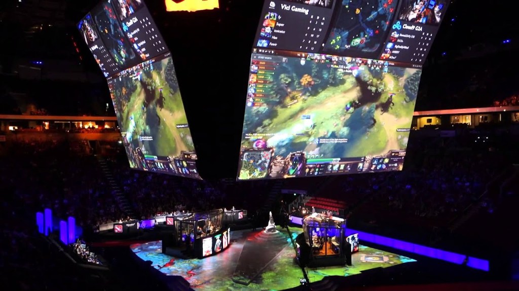
This arena has the players in the two sections underneath the main screens which display the game in a large view for all to see. The difference for my own design is that my ‘game’ is a sort of hologram style which means that the whole middle will be a large arena in itself while the two teams are ‘plugged in’ either side. The station in which they plug in however can take notes from the small containers the players are in, why the plug in machines will be vastly different to computers, having this section in mind will allow me to design it better. The big screens however would still be in place over the top of the battlefield to allow for further out viewers to see.

broadcasting hud

This HUD is very important to design as it adds to that gaming sports feel. However, the way in which all details are shown at the bottom is somewhat unnecessary for my own world due to the lack of items and currency usage. With this HUD however, it displays the match details such as players and score at the top bar. This is something I feel is needed heavily in my own design.

flags / banners

Within the DOTA match, each team will be given a custom flag to display their team icon. This is something that I look for in terms of branding. While it only stays in their base it follows similar styles to a football game, one side is theirs with fans showing support and the other has the same for the other team. This is something I intend to emulate, that feeling of rival fans chanting to carry their teams forward. Back to the flag branding, having these in bases allows to give off that feeling of importance and gives off feelings of pride when seeing your team literally fighting for the flag.

Contextual Analysis – Colours in Art

When it comes to character design and Icon design, I need to make sure that each colour choice is correct and is meaningful. The same goes for Icons, making sure they follow the main colours of their owner. Finally, I need to conduct research into fonts to make sure I choose the best font to display the names of my Avatars on the Wix Website.

Colour

Colour psychology allows me to delve into the effects of colour and how we view them as consumers. Colours allow us to identify danger/love, it can allow us to see gender into unknown areas and toys, and it also allows us to create art that ‘speaks’ to the consumer through the colour choice. I must also take into account of what my audience is and how they will percive these colour combinations.

With many articles we can see the effects of colours on genders and even ages, such as how males identify that red on females is more attractive while females have no preference. The same works with age that more bright and interesting colour attract younger ages such as children with lego. Due to my audience being a majority male teens, I need to make sure that I am using intresting colours while not sacrificing the realism of the characters dress/armour.

To make sure I can display my knowledge of colour understanding is at a level to which the audience is happy, I will set sets of colours for each characters and give the final choice to my audience. I will explain my choices also to try to show my reasoning. However, there will still be the set colours such as steel being grey, the aim is to add secondary colours that will allow consumers to invest with the overall feel of the character.

Centurion

For the Centurion character, who is a strong man with inner rage for his posistion and failure to save his father. Due to his knight like look, the armour will have to be grey but his cloak and blade are up for contention.

Set one – Grey/Red/Black = Red for his cloak showing anger for his life while the black will be his blade signifying grief.

Set two – Grey/Blue/Red = This time blue will be the cloak colour as it shows masculinity and Red for the blade colour signifying power over his opponents.

velocity

For the Velocity character, who is seen as a clown team mates until his ruthless agressive speed comes to play. Due to his robotic legs being in place, these colours will have to be a light black colour such as grey, similar to Centurions armour and the same for his dual Chakrams. However, his fur is what is needed to be coloured.

Set one – Grey/Red/Yellow = Red and Yellow combination of fur would siginfy to the old DC character of Flash who is known for his speed powers. But other than this could show Anger and humour.

Set two – Grey/Yellow/Black = The yellow would be the main fur colour to show his bright nature but plagued with black spots to show anger and grief. This would also fit the cheetah look of the character.

Clemency / Ruthless

For the joint characters I will need to do a set each. These colours must be contrasting and meaningful of the wing colour around them. The light wings will be bright white whiel the dark wings will be black. Her staff weapon will only change main colour apperance which allows for more freedom. The colours will mainly be Armour colours as the wings cover the majority.

Set one – White/Blue/Yellow & Black/Red/Purple = The angelic side requires highlighted colours to shine ‘bright’ therefore white is the main colour choice with blue and yellow being backup decal. The other side is the demon look that must stand out but also seem dark adn gloomy. As such I choose black for the main contrast and Red and purple that are direct opposites of the other decals.

Set two – White/Green/Brown & Black/Orange/Red = Similar for the demon side of things, I aimed to create a pallette that gave off a more lava/explosive look. However, the main change for the angel side was the inclusion of more earthly colours showing a nature/spirtual style. A style that is universally loved and is about growth against the lava destruction style.

Regicide

For this ruthless character, I must choose colours that show the anger and sheer pain of the monster. However, his main colour will be his fur, the rest can be his claws and other features. This is as his character is that of a monster like werewolf with razor sharp claws. He also has dark magic oozing fro his wounds and features.

Set one – Black/Red/Green = Black will show the grief of the character and overall ‘darknees’ he rings. It will also help sell this idea of a monster in the dark. The red is for his claws showing his anger and signifying blood. The green acts as the energy oozing from his body that feels like a toxic chemical as if he is a monster like Bane.

Set two – White/Red/Black = White for his fur showing a pure and noble style outside of his body while he leaks black enegry. This acts like the inner darkness is coming out while his noble shell holds together. The red for his claws is the best choice with its double meaning of blood and anger. It also can be splashed on his fur to show his destructive tendecies.

vyrus

For this machine like character I must ensure that I collect a pallette of colours that show the mystery of his power, the all knowing nature he gives off and the authority he demands. Due to his machine like body he has electrical orange sparks which is something I need to create the colour set around. The colours will be for his mask, poncho and clothes.

Set one – Black/White/Black = This combo has the Mask and clothes at black showing his shady nature with a white poncho that contrasts with the other two. This white usage is to show the characters secret desire to stand out.

Set two – Yellow/Black/Yellow = The black and yellow combination is a styel that will work as if the character was wearing a hazmat type suit. This plays into his machine like persona. The black of the suit shows mystery and grief while the yellow shows domainance and authority, something that his role commands.

With all these sets collect I will create a large questionnaire and gain my feedback in which I will complete a blog for, going through the answers and results. With this answered I will then be able to move on to actual production.

reference
Psychological Properties Of Colours – Colour Affects. (2008). Retrieved 5 March 2020, from http://www.colour-affects.co.uk/psychological-properties-of-colours

Idea Development – Characters / Avatars / Icons

This blog will act as a slight checkpoint to catch up my work and explain the vision I see for my characters. I will explain the idea behind my characters, the idea with the Avatars and the Icons.

Characters

In my world, each team requires 5 members, each serving a vital role of the team:

  • Top laner – These guys sit at the far left lane of the map (the top if you watch through the broadcasts). They act as the second in command of the team who fights the enemies Top laner. They make sure to push the lane so that if the team needs to funnel down a lane to push into the enemy base they can allo go to theirs. The second in command role is to take command if the leader (Mid Laner) falters and if they fall on the battlefield. To fit this role you need to be strong alone and have some leadership skills.
  • Jungler – These guys act as the backup that hides in the shadows. In LoL Junglers kill beasts in the game and build up power like that. In Exodus, Junglers build power by running between the three lanes and ganking (Term for ambushing) with hit and run tactics. They are usually needed to be fast and lethal in accuracy.
  • Support – This role is pretty self explanatory. They act to trap and hook in enemies to their teammates for them to gain the power by killing while they build power by getting the assists. They usually follow the ADC player to act as a waiter feeding them up until they reach their top potential, otherwise they act to save teammates from fatal attacks. They need to be caring and quick reactions, a large number of Supports are females due to their ability to feel their emotions to enhance their Avatars abilities.
  • ADC – ADC is short for Attack Damage Carry, these are characters that start weak but with the help of supports build up power to become major damage dealer late game. ADCs and Supports sit at the far right lane (the bottom from the broadcast view) and pushes against the other teams Sup/ADC. Their goal is to stop the other team’s growth with their own. ADCs need to be unstable to a degree, they are major pain dealers. They require close intimate relations with the Support to make for perfect symmetry.
  • Mid Laner – The leader of the team. Mid laners control the battlefield with their major intellect. This role demands major leadership skills and general genius level tactics. they play in the Mid lane fighting the other teams mid, they push this lane to build dominance over the other leader. Mid laners need the highest mental fortitude and will be called upon to perform incredible under pressure.

The Northern Teams members fit into this role with their own personal issues to beat:

Joseph Solomon is the teams Top Laner. He lives alone with his mother due to the passing of his father due to illness. This pain was all caused due to the mistreatment of the North. Joe takes care of his mother and takes on labour to pay for meals and what not. Joseph is well built and stands over 6 foot for his young age, However, due to the death of his father he never believes in himself. He believes himself weak and this is the major issue that he must beat, his goal is to earn enough money to get his mother the life she deserves.

Wyatt Faith is the teams Jungler. He lives with both parents who work hard to give him a safe live. However, Wyatt lives a daredevil lifestyle and is aggressive to other nations as he sees them worse than scum. This hatred and lifestyle was born from the death of his brother. His brother worked as a builder until a fault with the health conditions caused a collapse killing him. The cause was the lack of fundings from the other nations, from this point on he enjoys the idea of crushing other nations in the Exodus games. He is a short messy haired boy who is a clown to his friends, but ice cold to enemies.

Paige Chambers is the teams Support. She was abandoned by her parents and put into the harsh living of the orphanage. She was beat up by other girls at the institution due to her black short hair. This meant that she would never be adopted due to the marks. That’s when Kaiden helped her, he protected her since then and she has fallen in love with him more and more. She followed him into the games to protect him and her friends. This is her chance to protect others and show her willpower. Making sure that no one goes through the pain that she did.

Kaiden Moore is the teams ADC. Kaidens family was killed by a crazed madman. He was sent into the orphanage with a burning hatred for everyone and everything. He would fight and badly hurt people who got in his way. That was until he meat Paige, she gave him reason. He could mould his rage into a protective force. When he was old enough he choose to go into the games for a secret reason. His goal was to admit his love for Paige if he was ever able to win the World championships. This would show that he is strong enough for her as he sees himself as a low life.

Darren Jones is the teams Mid Laner. Darren’s parents were killed due to overworking just to get by. Darren dreamed of a world where he could save the North from this world of pain that everyone had to live through. He wanted to do this by becoming the best Mid laner, however his Avatar was terrible and he could barely even compete. After the horrific bullying he finally snaps, unlocking his true Avatar. The reason it never came out before was because he was hacked so that it wouldn’t show, this was done by the South as unbeknownst to Darren, his father was the leader of the first ever North winning team. This meant that Darren would inherit his father’s abilities. He found out that his family was murdered for this and started his journey of vengeance against those that wronged all of the North.

Each of the teammates Avatars reflect their inner ‘beast’:

Joseph’s Avatar is Centurion, The Warrior Golem. This Avatar is a large / bulky knight like warrior that stands far above the rest. The initial thoughts are that he is a large set of knight armour with a cloak and iconic helmet piece that hides his Avatars face. This character will represent that on the outside he is a honourable knight that has a heart of gold, but through his abilities I will show the merciless rage inside for his foes. His weapon of choice will be his blade.

Inspiration for this character comes from the League of Legends Mordekaiser and Overwatch Reinhardt.

Wyatt’s Avatar is Velocity, The Robotic Predator. This Avatar is human sized but with a animal look. The top half of his body is of a Cheetah (Or any animal like look / hyena is second best) while the lower torso to legs are robotic allowing for the speed implied in the name. This will show Wyatt’s aggressive personality while having the stereotype of the Hyena laugh clown. Showing both hatred to enemies and joyful clown to team. His weapon of choice will be a dual chakras.

Inspiration for this character comes from the Apex Legends Octane and Overwatch Lucio.

Paige’s Avatar is Clemency, The Angelic Grace. This Avatar is human sized but floats just above the ground giving a taller appearance. Clemency looks like a armoured angel with light wings blasting from either side. Her face is hidden from view by a hood with only white eyes in sight. This look however transforms into a demonic look: Ruthless, The Demonic Rage. In this form she has the same armour but with darker colours and bone like wings. Instead of white light from her eyes, she has dark red showing this rage filled change. This is to show the split in personalities to Paige, the loving side of one and the rage based power of the other. Her weapon of choice for both personalities will be a staff of either light side properties or dark side properties.

Inspiration for this character comes from the Overwatch’s Mercy and League of Legends Morgana / Lux.

Kaiden’s Avatar is Regicide, The King Slayer. This Avatar is tall but not to the height of Centurion. This character takes on the look of a werewolf type character but has void magic like properties to his body such as wounds that leak this black ink energy and even dark energies around the claws. Creating a cruel mystical killer. The rage of Kaiden is express through this medium with only his heartfelt side being shown in his protection of Paige. His weapon will be his razor sharp jagged claws.

Inspiration for this character comes from the League of Legends Rengar and Overwatch Reaper.

Darren’s FAKE Avatar is Player, The Cursed One. This Character was a copy of Darren but with medieval robes on. This was the faked character and as such had no real tell or point.

Darren’s REAL Avatar is Vyrus, The Hated One. This character is the true Avatar of Darren. This character is still human sized similar to Velocity. Vryus has a mask over his face and is hooded by a large torn up black poncho. His gauntlets show electrical coil like devices that orange energy surrounds. His character is made to be a mysterious hidden character of immense power similar to how Darren was hidden by the world even with his potential. His weapon is mainly his own energy, using this to fire magic blasts.

Inspiration for this character comes from the League of Legends Ryse and Apex Legends Revenant.

icons must also show this avatars being/soul:

These Icons are similar looking to the Rainbow six Siege ones, but with obvious changes inside each of the icons for each of the Avatars. These are used to identify Avatars from the broadcast.

Centurion will have a Sword slamming down, breaking through a wall showing the ‘pushing’ style of Centurion while also displaying his main weapon of choice. The colours would vary of the later choice of the audience in my primary research.

Velocity will have one of his Chakra blades spinning in a wheel motion as if its about to take off. The smoke off the blade will shoot off to the right. This shows his speed like attribute with his speed included.

Clemency / Ruthless have a joint icon to avoid constant changes. It will be split down in the middle, the main piece of the art will be a face. The left will be a normal fine face while the other side will be deformed and demonic. Showing the split in character.

Regicide will have a simple clear cut icon to show his power and inner hatred. This will be a blank background with a four claw mark ripping into the icon, leaving torn material.

Vyrus will have a machine like virus sign. One that consists of a hooded character but instead of a face it will be a single eye. This shows the hidden all knowing power, while playing to the machinery like character.

moving forward…

This blog allows me to jot down the aim of my characters and show clear path when looking at which way to take to gain my product. Having a chance to create this blog every now and then allows me to create somewhat checkpoints for those looking at my work. It also helps me recap myself when going on. Next I intend to complete a blog on the final choices of maps/radars and other pieces of art I intend to complete allowing me to accomplish these.

Contextual Analysis – Reception Theory

After explaining the idea behind my Avatars, I had a thought about the way an audience would see this and other parts to my work. I have already completed my target audience work and have successfully found them. However, researching into reception theory and seeing how it affects my work will help me understand and refine my art.

Reception Theory was developed by Stuart Hall. This is the theory that delves into the process of a Producer encoding hidden information and values into media, while the viewer decodes this into their own view. This ‘decoding’ has been formed into three sections of viewing.

Dominant / preferred reading is the form of the audience clearly seeing what the producer is saying and taking this message fully. This style is used in simple moments of information exchange when viewing that certain media. In gaming this would be shown best in Overwatch’s Reaper who is designed perfectly in a way of being evil – no room to discuss.

Oppositional reading is the act of a rebellious audience. This is the act of the viewers taking another view on what the producer has intended, this in most cases causes major debates within the community and can even cause legal issues if messages are read REALLY wrong. An example of Oppositional reading is the take of Katsuki Bakugou. This character has been written in a way to cause the community to hate him with his character being a major bully saying very harsh things to innocent individuals. However, the community has become massive fans of Bakugou and have somewhat forgiven what he has done by allowing growth of the character which has been shown throughout the series. The simple change of view from this villainous character is a perfect example of Oppositional view.

Negotiated reading is the act of a half and half reaction of the other two. This act is to understand what the writer has said and still have that other view. A perfect example of this is the GTA series. GTA has been trashed about the violence and sexual scenes that the game includes. However, many individuals understand that what you do in the game is highly illegal and will never follow this path at all BUT then also understand that it’s a game. This view allows you to see the evil and terrible aspect of the game while also having the other side of how it is harmless due to the fact that it is only a game.

If I was to choose one for my own art and writing, I would have to say the preferred writing. In the Exodus I have laid out my character and will lay out my Avatars in a clear way to show what I have intended. Unlike other pieces of art which allow for reading between the lines mine is aimed and precise. Something that allows me to lead my audience on a story of my design, eliminating all unforeseeable threats.

reference
Revisionworld.com. 2020. Reception Theory – Media Studies – Revision World. [online] Available at: <https://revisionworld.com/a2-level-level-revision/media-studies-level-revision/reception-theory&gt; [Accessed 1 March 2020].

Contextual Analysis – Iconography

When it comes to designing my characters and icons, I need to make sure that every clothing choice, pose and every facial detail helps craft a story. While I am now able to see the design in which my audience wish to see, that being Overwatch character style and Rainbow Six Siege icons, I must ensure that this is not sacrificed in a way that does not allow me to express the personality and attitude of the character, something that I mainly need to display in the Avatar creation. This is where my Iconography blog can assist me.

First, I must define what Iconography actually is, in terms of art and creation. Iconography is the use of traditional symbols to symbolise a concept or meaning. For example, in Overwatch, the character Reaper is seen as a mass murderer who is deadly at a mere touch. This fright and evil is shown through his dark colour combination and his grim reaper style clothing choice. For my actual Icons that will be incredibly important, I must ensure to create something that relates to the character with a simple image. An example of this relation is Sledge’s Icon in Rainbow Six Siege, in which his icon is that of a smashed wall next to a sledgehammer, his signature weapon.

In terms of movies or films, Iconography becomes redundant when the actual character is shown on screen or on all marketing. This means that they will never have to reference the character or what his background is due to the high viewership and general openness of the character. In games however, Iconography is one of the best ways to secure your games public reception while also helping the marketing. While I mention marketing, I don’t mean that I intend to sell my product, what I am doing is thinking from the standpoint of the viewers watching the Exodus games (This is the name of what the games are actually called inside the story of my game) who will not be able to keep up with what everyone is doing inside the arena. Therefore I need to make sure that I take a more branding style approach to these Icons, such as Cristiano Ronaldo’s CR7 unique brand but in a more visual sense than name tag.

A perfect example of Iconography in media is within the My Hero Academia manga which is a story of Heros with a more educational setting. The character Katsuki Bakugo is a hot headed Hero in training who has major anger issues that sometimes brings into play his reasons to why he wants to help people. His superpower is the ability to create explosions from his palms which help his aggressive fighting style while also fitting his personality. The place in which Iconography enters is his suit design and personal look.

While he may look like a normal average student with no real meaning behind any choice, you are able to see the style in which his hair is designed. The explosive like look is the first piece of foreshadowing of his explosive nature. Next we move on to his suit. Straight away you notice the colour choices of black, green and orange each having a link to military explosive like weaponry. His best piece of armour is the Grenade bracers he wears on his arms. Not only is the utility explained for these but the art reflects so much of the character. The grenade fits perfectly for his explosive quirk while also displaying the perfect explanation for his character design.

This is something I need to take into account when creating my own characters. While having the blast full hair is a cool look. I need to make sure that it makes sense for my character to have it. With this understanding I feel confident in my ability to produce a product that has sufficient iconography and will allow me to express personality through my characters to avoid the scary blank slate that I intend to miss.

reference
Horikoshi, K., 2014. My Hero Academia. [online] En.wikipedia.org. Available at: <https://en.wikipedia.org/wiki/My_Hero_Academia&gt; [Accessed 1 March 2020].
Ubisoft.com. 2015. Tom Clancy’s Rainbow Six Siege | Ubisoft (UK). [online] Available at: <https://www.ubisoft.com/en-gb/game/rainbow-six/siege/&gt; [Accessed 2 March 2020].