For the East, the winner was the Owl. This creature is one that has been shown as a Guaridian in recent films and has always been a wise man’s pet through the Harry Potter series. This trope I believe is what lead to this choice and is a choice that I feel will allow me to clearly show the smart trait that this Nation prides itself over. The Eastern Owls.
The bullies of the West gained the Shark as their Icon. This for me is a perfect choice, the whole idea of the Shark fits the west. The predator in the water that hunts when smelling blood essentially hunting the weak is a perfect way of viewing their treatment to the North. It also foreshadows the cowardice the whole as well, the theory that punching a Shark in the nose makes it go away, is a perfect analogy of the fear that the North will bring to the Western Sharks.
The main bad guys to the South have come out of the question with the Snake. A cunning and deceitful creature that backstabs to win suits the style of the North. The snake is seen more as a fear bringing creature but in truth shows a layer of cowardice similar to the West that the North will bring forth. The Southern Snakes.
Finally, The North. They came out with the very unique crow choice. With the others the way they are, this choice is perfect and fits my narrative. The idea of the Crow being a symbol of the grim reaper shows its use in being a messenger of death. Something that the North will become when the rage of the Nation comes out in full force. Fear the Northern Crows.
With this blog completed I will be able to move Banners onto a more practical view, now I can concentrate in giving the Broadcasting HUD the same treatment. I will also create a final Banner blog to help with colour choice as the flags are something that can be imbued with audience feedback.
To ensure that I get educated answers, I went into detail around what each choice offered and the style that I would go for if that certain choice was made. For Arena, I needed to make a art piece of a shot of the crowd watching the games in the middle. With DOTA 2 winning this question I am able to place the use of screens to show those in the back of the crowd what is happening. It helps my futuristic point by using this expensive technology in a simple venue. I will also be able to use my idea of the plug in station similar to the way players play inside of the box. Due to the done deal that Arena research has got to in my work, I believe that with this answer I will be able to finalise my idea and start moving to a practical option, this will make way for my other aspects that require more attention to research.
The next question is to do with the looks of the broadcast. Similar to how a football game has information pop up about a player and scoreline are the design templates I wish to emulate. The winning of this was Rocket League. This allows me to take a more simple styled route as the other two had either nothing at all or too much for the average viewer to take in. This style will allow me to display team icons, scores, personal badges and mini maps.
Banner fits in with the whole feel of a arena fight and future style. The banner would act in game to display the nations flag for those to see outside of the Broadcasting HUD, this is similar to how fans cheer with team branded items. The Apex banner system works for individual players in game but what I will do is change this to a whole team banner showing the actual nation further pushing this theme of patriotism to a underdog state.
With this blog completed I am now abel to aim towards my final goal. To make sure I am fully aware of all design choices and to ensure I do not rush this process, I will continue to research into these aspects and round up my choices in a final idea development blog allowing to move on to the final phase of research and context.
As well as the Broadcasting HUD / Banner / Arena. I must also make sure that I can design a radar looking like mao that follows the codes of the actual MOBA standards. To clear up confusion around the keywords I will also make this statement. Arena is the actual Venue design that I will create. The map is a small blueprint version not in full detail. Not creating this ecxtra part as well allows me to still create it in a way and also gives me more time to add extre detail into my characters.
codes of a moba map
MOBAs have had different takes on how to progress to the enemy’s base. Some require pushing a objective down a lane all the way to the end with constant protecting and ambushing by opponents. However, one thing that has never changed since the first embers of the MOBA style was forged, is the three lane design.
As we can see with League of Legends, the three lane system works in the way the roles are created. This style gives lanes for every role to excel. The single fighters in Top and Mid, the Support/ADC in bottom and finally the mid spaces for the Jungler. This is something that I must take into account when it comes to creating the radar for the audience to understand the ‘shape’ of the field in which they fighter, this radar will also include icons to give a feel for what the audience would use to see where hidden players are.
This small creation by a member of the R6S community shows something that I intend to create. A simple blueprint image that has info to where pieces of the map is, small hidden places that players could use. Essentially a infographic map, this will allow me to create my own map while adding my own personal piece into the world.
In the article ‘The Geography of the MOBA Map’ goes into how the economy of the game is based around the creeps that allow players to farm and gain more gold leading to more items. This is a base for MOBAs that focus on tactical play. The three lanes funnel this economy meaning no one player gets more than the other, the Jungle parts of the maps even take into account those that don’t fit into that world. The one issue is that my game does not have creeps, and you gain power throughout playing enemies and defeating them. This is why I must argue against this theory. The way of the three lanes does more than funneling creeps. It funnels team play and forces players to go at it alone forcing communication to succeed and beat the other team. The top planning with your jungler to ambush players to help others build power, The support working together with the ADC to feed them up in power which pulls them along. These are plays that miss the economy of the game. It forces skillful plays and point perfect choices that could win or lose you the game. This is why I believe that the three lane is more to push people into situations of teamwork rather than the regulation of the economy of the game.
Having this blogged down will not only clear my aim but will allow me to move onto asking the opinions of my target audience about the other choices to then move on to research these pieces more. With this in mind, I will remember to catch this all up in the later on Idea development blog that acts as my own checkpoint.
After starting up a questionnaire for my colour research, I created my sets and went about collecting the answers so that I may final finalise my character research and move forward into other researching key points. The first question was about Centurion. When asking these questions I made sure to fully explain the character so that people understood who they are designing for. Out of the two sets for the knight character, G/R/B pulled through. The idea for my creation will be to use the Red for the cloak around the character like a traditional knight but also to infer anger hidden in plain sight. The Grey is clear to be a main armour colour with the Black being the main choice for the blade, this to signify grief and loss.
Velocity is one of the two animal characters I created so I needed to include colours that could reflect the fur of the beast. The winner of this question was the G/Y/B. This set in my opinion is the more freedom giving of the two as it allows me to create the shapes of Black fur spots over the Yellow fur. This signifies the grief of his character plaguing his bright vibrant lifestyle. the Grey again, similar to above, is for the metallic features.
Clemency/Ruthless is by far the most complex in terms of design. Due to the split personality style, but this also gives leeway to more creative outcomes to show these contrasts. The winner of these sets was the W/B/Y & B/R/P, while unfortunately the other set had a more spiritual like outlook, this set allows me to follow that neo type universe I intend to create and explore. These colour choices are vibrant but harshly contrasting the other, each representing the traits of their style. Be it love and care or hate and pain.
W/R/B came through at the question over Regicide. This allows me to follow the contrast in my murky wound feature, especially with the White fur against it. The Red of his blades expressing the anger flourishing of his rage and hatred. This is the key feature of the character and needs this point to come across with looks and colour choice.
This final choice went to the Y/B/Y set. This was a last minute set inspired by seeing construction workers. Something about the hazardous colour choice with the mysterious background fits well with the leader character. The machine aspect of the character also fits well and brings fear to the games, a clear contrast to how mistreated the main character was in the past and now.
With these answers I have now been equipped with the knowledge need to move onto other research points and issues. Next I will move on to my Geographical research topic including world building / broadcasting and other pieces I need to showcase my world.
After looking into the context of character design in the three games that has inspired me , I set about seeing which character and icon style was the one to emulate and learn. To make sure this choice benefits me and my audience, I created a short questionnaire.
The first question is to sort out the character design debate. To make sure each viewer knew what they were, I showed them the appropriate pictures allowing them to give their needed answers.
The second question was the same as the first in terms of showing what they would choose but in this case aiming it towards the Icons that I will be creating that will allow viewers to see who is who on the radar/map.
The results of the character design came out as a resounding Overwatch win. This style allows the expression of personality and ability to shine through the armour and looks. With this in check I now will be able to start sketching down rough ideas for my characters and allow myself the freedom to utilize this expression.
The Icon results showed me that the love was aimed at Rainbow Six Siege. The Icon use in R6S allows for each operator to have their own basic calling card that shows personality and general public prowess. Having this as my choice will allow me to take the time creatively to make sure that each character gains this badge of personal wildcard style, something to further help show story behind the character.
Results
Overwatch character design that will allow me to show personality in my characters.
Rainbow Six Siege Icon design that will allow me to create personal calling cards for each character.
With this lined out for me I can now take a further look into the symbolism of armour and looks while also taking into account Iconography in my art. Doing these blogs will help me further my skill and show understanding of the choices I make when my practical finally takes fruition.
In my previous blog I made an attempt at explain and showing what a MOBA is. However, due to the recency of MOBAs and its blow up in the gaming world, MOBAs have never been easily identifiable. The closest we could explain the genre of this style as a subsection of Action. This means that some of the codes within creating action characters need to revised to have these in mind when creating my characters. However, rather than going into action films and series, I decided to go into a similar styled game which happened to take more action approach than more MOBAs.
overwatch
When it comes to out and out action in a MOBA game. No other tops the team battles of Overwatch, with the addition of its first person shooter style, excels in high tension competitive fights that demands action split into every character. From the dangerous charm of Mcree to the insidious danger of Reaper. These characters are designed to show each and every bit of their fighting persona.
Mcree with his gunslinger like look and his heroic looking cowboy hat demands that charm that is seen in the old western movies. Each part of clothing is a iconic take on a futuristic cowboy with even a revolver as he main weapon and a cigar in his mouth; clear homage to Clint Eastwood. But from a Action standpoint, cowboys are the olden day power ranger type characters, always display as mysterious heros with a out of this world gun ability hunting the criminals of the world. Mcree is built to be this awe inspiring hero character with this cowboy trope, the ripped poncho showing the wear and tear of his veterency. These are all pieces of in depth background that form the action hero we play as.
On the other end of the spectrum is the main villain of Overwatch who hunts the heroes, Reaper. From his pitch black colour scheme to his iconic mask, each piece is place and designed to strike fear. The action sense comes though in the dual shotgun ammo belt locked to his chest with slugs. The sharp claw like armour similar to that of the bone like skeletal hand of the grim reaper is clear correlation to death. His mask is a unique take on the scream mask keeping the skeleton look that his sharp claws enforce. The final piece of this action like death approach is his grim reaper hood that is clear homage to death itself. Reaper screams action and is seen as insidious and malevolent from simple looks.
With further research into the topic, I was able to find a article that describe the overall design of characters very well helping me understand how to express this genre while staying true to my style.
This excerpt shows the importance of taking care in the inspiration of characters making sure you can fulfil what you set out to do. Be that creating a badass hero like Soldier 76 or a evil villain like Reaper. Each must have its background mapped to effectively create characters in various genres, and for action this means that we must build battle hardened fighters with personality to compliment their clothings and looks. This will be very important when creating my Avatars of my casual characters.
Looking into the demographics of viewers to similar games to mine will allow me to see a more defined and correct data bank. With such research towards my target audience, I will be able to direct refine my work to create the best product possible.
Age
Age within the MOBAs usually depends on the style and way the game acts. Games like Overwatch and Paladins. Two MOBAs that have very childish actions or atleast child friendly. While Overwatch has the large skill gap the cartoon style still attracts the younger generation while Paladins literally has a system in place to turn you into a chicken upon death taking that grim factor away, much like Fortnites avoidance of death allowing for its low age rating. Therefore, knowing that the age of these players will be low, I will make it a point to ask people at a higher range to collect educated answers of people who have played more games in general and will be able to use this to give me useful and out of the box ideas.
To further prove the standpoint that MOBA is a male dominated style helps me identify two things: The actual age range of players & clear up the sub genres of MOBAs. First, the style of a MOBA allows you as the player to take a win in two ways: Either tactically pulling the team apart or brute forcing your way. Whichever way you choose requires brilliance over the other team through skill. This gives players that sense of achievement and overall dominance. A feeling that is sought by young men who are going through there hormonal phase. This tension is a place of worship by the average teenager but doesn’t stop their. While that initial aggression wears off with time, growing up, men still see that style of beating an opponent as a satisfy victory, and with its massive competitive nature will easily hook a player til the age of around 24 -25. Due to learning of the attraction of MOBAs show us that this genre is close to action but in more of a arena battling sense. This will allow me to make the necessary work pieces towards the action genres codes and conventions when creating characters around that style.
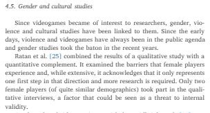
This piece of the literature reviews dives in on genders within MOBA genres. However, I believe that it is not as simple as it seems to be. Now, no matter how many questionnaires are sent out, they can never gain a accurate response when it comes to the two genders. Females have always had to fight against the stereotype of not being able to play games, while nowadays this is not the case but still happens from time to time. With a casual female player, they usually decided to not openly show that they are in fact a woman. This is through the years of stereotypes and other factors but still shows that it can happen and therefore creates that doubtful barrier around data when collecting information about gender. But it is clear to see why this genre of game is dominated by a male populace. MOBA games are aggressively styled to tactically annihilate the enemy, due to its nature there is never a draw option, you either win or lose. This competition fits perfectly for a young male, while making it a toxic environment for female players who have a lack in aggression.
To combat this point with my work, I will make sure to add representation in my art, therefore meaning that I will create a female character. In which I will ask an only female crowd over their opinions of the matter. This is not to limit a males choice. But will allow me to create a piece that stands proof that there is no difference between sexes. Creating a bridge over a sexist river that has been allowed to flow uncontended for years.
With this issue tackled and the information gathered on how and why I will be able to confide in a more varied audience, I will be moving on to actual case study of similar products allowing me to start asking my audience on features to improve my work further down the line. Also with this complete I must next move on to see how I would be able to validate this data to ensure 100% accuracy when making choices for the target audience in my art design.
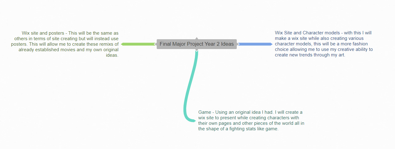
My project will be the creation of a game, focusing more of the art style and creation of characters allowing me to show my editing / graphic design skill. As such my project will be a graphic design piece with me creating characters, avatars of said characters, maps, landscapes and many more needed pieces. These all will be explained and presented on a create Wix site that will allow me to sketch layouts again showing my design skill. I had created a small mind map on various projects that I could complete:
As you see I knew that I would be going down the graphic design route, but showed many paths to take. The reason to my choice of game is that with it as my own hobb, it will allow me to find research sources en mass as well as solving other issues that I do in day to say life. While the others are similar I still feel that having that more personal link to the route will allow me to stay motivated as well as placing myself in a zone I know how to succeed in.
The genre of the game will be action with subs here and there. Action allows me to create fighters with stats and create harsh looking characters that will almost 100% fit in with such genre. The theme of the work in a desperate underdog fighting for freedom type story, allowing me to show this through the characters as well as the Avatars. I will be undertaking a TON of research, each bit allowing me to move a little forward. Much of this will be on other games and art styles with characters, all the while collecting information from my target audience allowing me to add things I myself may of missed. My practical will be the creation of the Wix site, Logo, Title, Map, characters and many other parts of the universe that will allow me to show my story and create my world. The audience will be the fans of League of legends style games, which covers a large group averaging to be about teen to young adults of both genders. Finally I will present my idea of various platforms, the initial place being Reddit and Twitter but is due to change with the more research I conduct. However, the one main place that is for certain, is the Wix website I will create.


 Final Major Project Year Two