Concept Research – Colours for Banners

This next piece of research is to make sure that I can effectively create banners that somewhat reflect the animals they use while also reflecting the ideology of the nation. With my work I have chosen to create four nation and therefore require 4 colours to suit each.

The East nation is that of a smart like people that put the brain in front of brawn. As such the animal I ended up finding to be the best was the Owl, a wise creature by symbolism and nature. To suit this creature and nation I must find a colour that represents both a level of intelligence and also joy due to their nice peaceful attitude.

The West nation is that of a strength first learning later quota. They hold power above all over attributes and as such have become a rather simple minded people who hold a bully like complex in their minds. The animal that was chosen to represent was the Shark. This is due to the sharks ability to hone in on blood making sure that its targets are already weak and therefore bullying them to death in a less fatal sense. The colour therefore must be that which shows strength and an overall predator feel to them.

The South nation is seen as the big baddies. The main bullies in this world that use the others to get to the north. As such the South is a smart controlling like people that manipulate the kind hearted people of the East and the idiotic West. This smart nature allows them to bully the north and show dominance and therefore to show this I will need a colour that signifies cunning and evil.

Finally, the North. These are the ‘good guys’ as they are where our characters are from. This was a prideful nation who reigned as friendly number ones until the South pulled the rug on which they stood. They now are poor, run down and vengeful. Hated by all for no reason which further pushes this violent emotion outwards. The animal I choose to represent this was a crow, the bad omen bird that signifies coming danger. Therefore I must choose a colour that shows this cold vengeance while also showing the grief in which these people live under.

In a previous blog I went in depth on the psychology of colours, and with this understanding I can effectively choose two colour for each nations banner and then allow the audience to decide in which one they prefer. To start I will explain the choices of the Northern nation.

I feel that the best two colours that could effectively show the aspects I wish to display would be cobalt blue and black. Black is the obvious go to when wanting to show grief, it allows me to play with a traditional evil colour and turn it to a more mournful one. This is the more simple choice out of the two but due to it then making the banner invert colours, making so the animal be in white not black, it allows for the north to make that perfect standing out feel. The second choice, cobalt blue, is more in reference to the actual reality of the North and their emotions. The dark blue which cobalt effectively shows helps build this bridge with the ice element that in turn helps show the hardened people of the North while keeping this dark vengeful view with the use of the crow.

Next we have the Eastern nation, represented by the owl. The choices for this side of the world would be Yellow and Purple. Purple is the intellectual colour that shows a level of pride as well, this plays in very well with the best attribute being the intelligence of their people. Purple also allows us to see a excited more giddy style, this helps to fuel this idea of them having this child like care while also keeping their wits about them. The second choice is Yellow, this colour is bright and acts as a beacon of child friendly joy, its pours out joy and happiness. This colour also helps us think of cartoon like electricity which can helps us build the bridge of a smart race of people due to them having the greatest technological advancements, fuelled by electricity.

Next is the predator like people of the West. Red is the only choice. This one is decided without a vote and I will explain now why I have made this choice. The colour of Red is the universal bad guy colour. It is used in gaming as the age old colour to identify enemies on a mini map and enemy names are usually highlighted in Red. Not only does it show this evil nature to the West, it also fits the Shark perfectly, the idea that the shark chases its prey from the weakness that they show after losing blood allows me to play this idea off in their nations banner. This is a no brain – er choice for me and I believe that people can understand why I use this colour and why nothing else could really match up to it.

Finally, the big baddies, the South nation. Purple and Orange. Orange is the colour that signifies fire, this in turn helps us see this nation as a ravaging force that consumes anything in its way. It also helps build the dominance of the South similar to how a fire will burn anything it can touch indiscriminately and that it will also assimilate anything that can help spread its flames like the Souths bullying mentality. Purple, similar to how I explained it for the East, shows the intelligence of its bearer but also helps in another way that further pushes the souths agenda. Purple is a naturally mysterious, villainous colour that many shows and media outlets use to express evil natures. These two aspects mix and purple starts to show this dark yet smart mystic vibe.

With all these listed out I intend on creating a short questionnaire to get the feedback I need for making these banners. After this I will be able to create a weekly reflection on what I had done and what I intend to do next.
Secondary Research – Most watched esports / viewer count

The aim of this blog is to find the highest viewed esports and to delve into the broadcasting view that people watch. Once I have found the top two, I will dissect the Broadcast HUD and explain why I will emulate this part or why I won’t. I will be using the year of 2019 to study for my research as it is the most recent completed year and with this years pandemic I believe that the results will be unusable.

Hore, J., 2019. The Biggest Esports Tournaments Of 2019. [online] The Loadout. Available at: <https://www.theloadout.com/tournaments/biggest-esports-tournaments&gt; [Accessed 3 March 2020].

number one

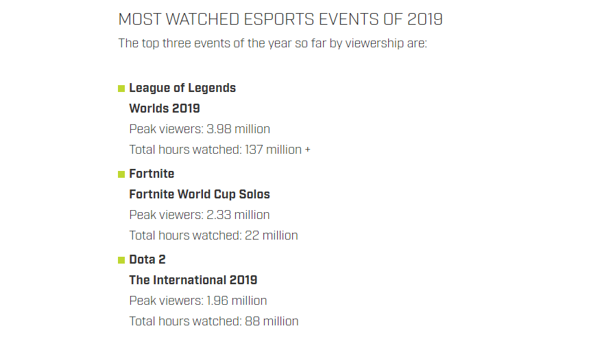
In terms of 2019 the highest viewed esports overall was League of Legends with a peak of 3+ million concurrent viewers. This was for the world championship event that League of Legends holds every year. The total hours watched was over 137 million. This is by far one of the most watched events of all time ever breaking even the super bowls 102 million view count that real, beating america’s most prestigious sports event.

Euw.leagueoflegends.com. (2009). League of Legends. [online] Available at: https://euw.leagueoflegends.com [Accessed 26 Feb. 2020]

The look of the League of Legends is similar to most birds eye view MOBA (DOTA 2 etc). They all follow the same style of having the character stats, health, power, skills and even inventory at the very bottom. This is something I will not be using. The health of the character will be kept to keep it in a game realm but not hovering over the character, just on the screen. Due to my games lack of economy and items, the rest is not needed and as such will be chucked. The other aspects include a profile shot of the actual player which is something I can’t do, but will be replaced with the use of the personal Icon I will be designing for the Avatars. The other side includes a mini map ‘radar’ that I intend to create for my own, this is something that will be included with my broadcasting view. However, rather than just a person viewpoint, I will added the images of other characters and adding these to a map so watchers can see everything.

The top bar usage is something I have stated in my previous context blogs to be something I really love and wish to use. The LoL style uses a small verison in the corner that shows the players stats and the teams score, I would use the top bar to show the players icons on either team similar to how I saw in Rainbow Six Siege in my previous research blogs. I would basiclaly make this bar bigger to show team score in the middle with the icon idea on either side, with the teams overall logo as well.

NUMBER two

The second place in the highest viewership of 2019 is Fortnite with its peak of 2+ million viewers and over hours watched totalling 22 million plus. This was for Fortnite first ever Solo world championship event. While this does not match anywhere close to the stats of LoL, it goes to show that there is still variety in the viewership market that thrives from all corners and gives me the chance to put these two games together and dissect the things they excelled at for my own work.

En.wikipedia.org. 2019. Fortnite World Cup. [online] Available at: <https://en.wikipedia.org/wiki/Fortnite_World_Cup&gt; [Accessed 2 March 2020].

The style that Fortnite views in is a POV skipping view. This is a way to show the audience through the biggest fights from both sides, this is against what I want and my ideal style. The details that are shown on screen is the character names and health on the far left which is something I will use but move in my own work. The profile shot and name which I intend to replace with my Icon design and join them all up as a top bar. And finally the mini map ‘radar’ which is a staple in commentary HUDs in the higher echelon.

The style for Fortnite isn’t all too bad. The way the camera can move than just the players view is good but not enough, my ideal style is that of being able to move the camera through the map at different points such as a football game.

En.wikipedia.org. 1992. Premier League. [online] Available at: <https://en.wikipedia.org/wiki/Premier_League&gt; [Accessed 2 March 2020].

The style of Football allows it so that you may view the whole ‘battle’ and every part while watching from a constantly moving camera, and extra viewpoints to swap to that gets a better angle on the play. This gives the audience a better feel of the game and engages them as if they were in the stands themselves. This is the view I intend to emulate while adding these various details that show score, players and map. A similar map is even used in the FIFA games that appears at the bottom to show players where the other characters are that are on their team and opposition.

Having this blog with the more redefined idea behind the details and structure of my HUD has allowed me to visualise this so that I may put down my final outcome in the Idea development blog later on down the line. But to make sure that my interests meet that of the audience, I will give two options to them to see which style is better for me to emulate.

references
Hore, J., 2019. The Biggest Esports Tournaments Of 2019. [online] The Loadout. Available at: <https://www.theloadout.com/tournaments/biggest-esports-tournaments&gt; [Accessed 3 March 2020].
Euw.leagueoflegends.com. (2009). League of Legends. [online] Available at: https://euw.leagueoflegends.com [Accessed 26 Feb. 2020]
syracuse. 2019. How Many People Watched The Super Bowl? 2020 Ratings Up From Last Year. [online] Available at: <https://www.syracuse.com/sports/2020/02/2020-super-bowl-ratings-102-million-viewers-up-from-last-year.html&gt; [Accessed 2 March 2020].
En.wikipedia.org. 2019. Fortnite World Cup. [online] Available at: <https://en.wikipedia.org/wiki/Fortnite_World_Cup&gt; [Accessed 2 March 2020].
En.wikipedia.org. 1992. Premier League. [online] Available at: <https://en.wikipedia.org/wiki/Premier_League&gt; [Accessed 2 March 2020].

Primary Research / Problem Solving – Audience Feedback – Banners

For the East, the winner was the Owl. This creature is one that has been shown as a Guaridian in recent films and has always been a wise man’s pet through the Harry Potter series. This trope I believe is what lead to this choice and is a choice that I feel will allow me to clearly show the smart trait that this Nation prides itself over. The Eastern Owls.

The bullies of the West gained the Shark as their Icon. This for me is a perfect choice, the whole idea of the Shark fits the west. The predator in the water that hunts when smelling blood essentially hunting the weak is a perfect way of viewing their treatment to the North. It also foreshadows the cowardice the whole as well, the theory that punching a Shark in the nose makes it go away, is a perfect analogy of the fear that the North will bring to the Western Sharks.

The main bad guys to the South have come out of the question with the Snake. A cunning and deceitful creature that backstabs to win suits the style of the North. The snake is seen more as a fear bringing creature but in truth shows a layer of cowardice similar to the West that the North will bring forth. The Southern Snakes.

Finally, The North. They came out with the very unique crow choice. With the others the way they are, this choice is perfect and fits my narrative. The idea of the Crow being a symbol of the grim reaper shows its use in being a messenger of death. Something that the North will become when the rage of the Nation comes out in full force. Fear the Northern Crows.

With this blog completed I will be able to move Banners onto a more practical view, now I can concentrate in giving the Broadcasting HUD the same treatment. I will also create a final Banner blog to help with colour choice as the flags are something that can be imbued with audience feedback.

Theoretical Awareness – Symbolism with Animals

When it comes to banners for the four nations in my world, I must find a way to display their styles and life with symbolism. The best way to show this is through animals who have been used at nearly every single countries flag in the modern world. For example, the english have the Bulldog giving a grimey like feel to the island. These animal choices must be perfectly suited to the nation hence why I will complete this blog. We see animals also used in shows such as Game of Thrones for certain houses. Such as House lannister that adorns a Stag, showing pride within their evil ranks. And House Stark, being that of a wolf, playing into their cold environment and pack like families. We also see many animals used in the chinese year calendar that gives traits and personalities to these animals.

west

The Western nation is one of strength and strength alone. They produce the most physically talented players and people. This doesn’t mean to say that they are stupid, but in a world where brawns is over brains, intelligence tends to get left behind. Out of all the nations, they feel best with the water. Most islands have fishing docks as this is their main export, as a people they also call upon the sea gods for luck. They are a vary labour heavy nation, who will do what is needed for coin. The West have thrived well due to the bribery of the South and as such continue to harass the North by purposely forgetting food exports to mess with them. They enjoy tormenting the North as long as they still gain coin from the deeds, besides the fact that the West enjoy hurting the weak.

For these people I need to choose an animal that fits with each aspect of their traits.

In terms of the strength side I could use the Gorilla. The Gorilla is an animal of pure strength and brute force through situations that would in other worlds require brains. In terms of the Water part of their lives, I would call upon a Shark. This links with the sea god worship and fishing exploits. It also plays into the bullying style that the West surrounds themselves in. Another choice could be, Wolves. This simply plays into that pack nature of tearing down foes together. Regardless of their situation.

east

The Eastern Nation is one of intelligence and knowledge consumption. These people live around storing and collect knowledge for history and the future, they produce the smartest players. The main exploit of the nation is its libraries and knowledge stockpile, they usually act as accountants and tacticions as well. The East prides itself on peace and loving of all nations, leading to them being the only nice nation to the North. This is in turn why the East is ranked third. Even though they are nice and caring, even they take the bribes of the South and benefit of the target being on the North. They wish to one day bridge the gap that fits between the nations and save the North, but due to their overall weakness, they are no threat to the bullies.

The animal choices for this country must stick to their traits. The first animal is the Owl, they are seen as scholar like pets and are wise creatures. Another could be the Snake. This shows the cunning nature of a seamlessly weak foe, ready to strike when the time to right. A final choice for a animal is a turtle. A slow, old wise creature that slowly progresses to its goal, but like all myths, it always get to where it needs, no waver.

south

The Southern Nation is the spite of this world. They are the richest, most prestigious snobs the world could collect. Due to the place they live, gold is mined heavily. This means that the money comes through them, and with this power has become the self proclaimed leader of the nations. They produce the best trained players due to the heavy advantage of brand new training equipment making even the weakest player the best. Due to the jealousy they had over the North in their early days, they decided to bribe the officials and cheat to a win, with this team they became the Unkillables. This was due to a hack they used that would make them 10x stronger than the other players. After this they crushed the North and bribed the others to make sure that they could never take their place at the top again. That is the true story, while the one that is recorded is that the Unkillables are real and are just the best team to ever be.

When it comes to animals for these monsters of the modern world. The first is to play into the greedy style, a fox. The main animal that represents the greed of men. Similar to the East, A snake could be a good choice due to the cunning deceit and betrayal that they throw their cards with. Or a Stag. Similar to that of the House Lannister in GoT, these are gold hoarders who are the snobs of the lands. This is something that emulates their tastes best.

north

The Northern lands is where our characters hail from. A fair and caring land turned Vengeful and harsh. The nation is in bare minimums, held up by the grace of the South to remind them of their place. Due to the skill of the first North teams, they claimed the first world championship, which lead to their end with the cheating of the South. The whole nation is now barely up and produces the weakest players due to the lack of training, essentially making it so that the North can never rise again. Due to this poorness, they have nothing to give other than coal. A burning hatred for everyone is within every citizen, the East is friendly but due to the treatment by the West, the North finds it hard to forgive. The only export they make outside of the games is the coal mines, which kills hundreds of miners every month due to the health condition. The North sits in the place of a slow constant death.

When it comes to the Animal behind the Northern nation a few jump to mind. The wolf is a solid choice. The pack life, sticking together to survive is the perfect view of the North lifestyle, it also works well to some the cold environment of the nation similar to that of the House Stark of Got. Another could be a Crow, its symbolism of death coming and the overall harbinger of pain is a symbol towards the coming tide of parentless children of the North seeking blood. Bear is my final choice, this beast shows the loneliness of the hunt to live while showing that cold habitat. It also shows the power behind even one person while pushed enough.

With this blog I will be able to visualise the colour and style of my Banners and move to a more practical mindset. To complete this mindset however, I will ask my audience to choose which Animal they believe I should use. This will allow me to move on to practical and create the first wave of Banners. Next I will look into arena viewer counts to see which HUD is the best and why I follow or don’t follow this, in turn arguing the theory behind the popularity. I will also create a questionnaire and concept blog around which is the best choice for my Banner colours.

reference
Martian, G., 2016. Game Of Thrones. [online] En.wikipedia.org. Available at: <https://en.wikipedia.org/wiki/Game_of_Thrones&gt; [Accessed 2 March 2020].

Primary Research / Problem Solving – Audience Feedback – Arena / Broadcast HUD / Banners

To ensure that I get educated answers, I went into detail around what each choice offered and the style that I would go for if that certain choice was made. For Arena, I needed to make a art piece of a shot of the crowd watching the games in the middle. With DOTA 2 winning this question I am able to place the use of screens to show those in the back of the crowd what is happening. It helps my futuristic point by using this expensive technology in a simple venue. I will also be able to use my idea of the plug in station similar to the way players play inside of the box. Due to the done deal that Arena research has got to in my work, I believe that with this answer I will be able to finalise my idea and start moving to a practical option, this will make way for my other aspects that require more attention to research.

The next question is to do with the looks of the broadcast. Similar to how a football game has information pop up about a player and scoreline are the design templates I wish to emulate. The winning of this was Rocket League. This allows me to take a more simple styled route as the other two had either nothing at all or too much for the average viewer to take in. This style will allow me to display team icons, scores, personal badges and mini maps.

Banner fits in with the whole feel of a arena fight and future style. The banner would act in game to display the nations flag for those to see outside of the Broadcasting HUD, this is similar to how fans cheer with team branded items. The Apex banner system works for individual players in game but what I will do is change this to a whole team banner showing the actual nation further pushing this theme of patriotism to a underdog state.

With this blog completed I am now abel to aim towards my final goal. To make sure I am fully aware of all design choices and to ensure I do not rush this process, I will continue to research into these aspects and round up my choices in a final idea development blog allowing to move on to the final phase of research and context.

Primary Research / Problem Solving – Audience Feedback – Character Colour

After starting up a questionnaire for my colour research, I created my sets and went about collecting the answers so that I may final finalise my character research and move forward into other researching key points. The first question was about Centurion. When asking these questions I made sure to fully explain the character so that people understood who they are designing for. Out of the two sets for the knight character, G/R/B pulled through. The idea for my creation will be to use the Red for the cloak around the character like a traditional knight but also to infer anger hidden in plain sight. The Grey is clear to be a main armour colour with the Black being the main choice for the blade, this to signify grief and loss.

Velocity is one of the two animal characters I created so I needed to include colours that could reflect the fur of the beast. The winner of this question was the G/Y/B. This set in my opinion is the more freedom giving of the two as it allows me to create the shapes of Black fur spots over the Yellow fur. This signifies the grief of his character plaguing his bright vibrant lifestyle. the Grey again, similar to above, is for the metallic features.

Clemency/Ruthless is by far the most complex in terms of design. Due to the split personality style, but this also gives leeway to more creative outcomes to show these contrasts. The winner of these sets was the W/B/Y & B/R/P, while unfortunately the other set had a more spiritual like outlook, this set allows me to follow that neo type universe I intend to create and explore. These colour choices are vibrant but harshly contrasting the other, each representing the traits of their style. Be it love and care or hate and pain.

W/R/B came through at the question over Regicide. This allows me to follow the contrast in my murky wound feature, especially with the White fur against it. The Red of his blades expressing the anger flourishing of his rage and hatred. This is the key feature of the character and needs this point to come across with looks and colour choice.

This final choice went to the Y/B/Y set. This was a last minute set inspired by seeing construction workers. Something about the hazardous colour choice with the mysterious background fits well with the leader character. The machine aspect of the character also fits well and brings fear to the games, a clear contrast to how mistreated the main character was in the past and now.

With these answers I have now been equipped with the knowledge need to move onto other research points and issues. Next I will move on to my Geographical research topic including world building / broadcasting and other pieces I need to showcase my world.

Contextual Analysis – Colours in Art

When it comes to character design and Icon design, I need to make sure that each colour choice is correct and is meaningful. The same goes for Icons, making sure they follow the main colours of their owner. Finally, I need to conduct research into fonts to make sure I choose the best font to display the names of my Avatars on the Wix Website.

Colour

Colour psychology allows me to delve into the effects of colour and how we view them as consumers. Colours allow us to identify danger/love, it can allow us to see gender into unknown areas and toys, and it also allows us to create art that ‘speaks’ to the consumer through the colour choice. I must also take into account of what my audience is and how they will percive these colour combinations.

With many articles we can see the effects of colours on genders and even ages, such as how males identify that red on females is more attractive while females have no preference. The same works with age that more bright and interesting colour attract younger ages such as children with lego. Due to my audience being a majority male teens, I need to make sure that I am using intresting colours while not sacrificing the realism of the characters dress/armour.

To make sure I can display my knowledge of colour understanding is at a level to which the audience is happy, I will set sets of colours for each characters and give the final choice to my audience. I will explain my choices also to try to show my reasoning. However, there will still be the set colours such as steel being grey, the aim is to add secondary colours that will allow consumers to invest with the overall feel of the character.

Centurion

For the Centurion character, who is a strong man with inner rage for his posistion and failure to save his father. Due to his knight like look, the armour will have to be grey but his cloak and blade are up for contention.

Set one – Grey/Red/Black = Red for his cloak showing anger for his life while the black will be his blade signifying grief.

Set two – Grey/Blue/Red = This time blue will be the cloak colour as it shows masculinity and Red for the blade colour signifying power over his opponents.

velocity

For the Velocity character, who is seen as a clown team mates until his ruthless agressive speed comes to play. Due to his robotic legs being in place, these colours will have to be a light black colour such as grey, similar to Centurions armour and the same for his dual Chakrams. However, his fur is what is needed to be coloured.

Set one – Grey/Red/Yellow = Red and Yellow combination of fur would siginfy to the old DC character of Flash who is known for his speed powers. But other than this could show Anger and humour.

Set two – Grey/Yellow/Black = The yellow would be the main fur colour to show his bright nature but plagued with black spots to show anger and grief. This would also fit the cheetah look of the character.

Clemency / Ruthless

For the joint characters I will need to do a set each. These colours must be contrasting and meaningful of the wing colour around them. The light wings will be bright white whiel the dark wings will be black. Her staff weapon will only change main colour apperance which allows for more freedom. The colours will mainly be Armour colours as the wings cover the majority.

Set one – White/Blue/Yellow & Black/Red/Purple = The angelic side requires highlighted colours to shine ‘bright’ therefore white is the main colour choice with blue and yellow being backup decal. The other side is the demon look that must stand out but also seem dark adn gloomy. As such I choose black for the main contrast and Red and purple that are direct opposites of the other decals.

Set two – White/Green/Brown & Black/Orange/Red = Similar for the demon side of things, I aimed to create a pallette that gave off a more lava/explosive look. However, the main change for the angel side was the inclusion of more earthly colours showing a nature/spirtual style. A style that is universally loved and is about growth against the lava destruction style.

Regicide

For this ruthless character, I must choose colours that show the anger and sheer pain of the monster. However, his main colour will be his fur, the rest can be his claws and other features. This is as his character is that of a monster like werewolf with razor sharp claws. He also has dark magic oozing fro his wounds and features.

Set one – Black/Red/Green = Black will show the grief of the character and overall ‘darknees’ he rings. It will also help sell this idea of a monster in the dark. The red is for his claws showing his anger and signifying blood. The green acts as the energy oozing from his body that feels like a toxic chemical as if he is a monster like Bane.

Set two – White/Red/Black = White for his fur showing a pure and noble style outside of his body while he leaks black enegry. This acts like the inner darkness is coming out while his noble shell holds together. The red for his claws is the best choice with its double meaning of blood and anger. It also can be splashed on his fur to show his destructive tendecies.

vyrus

For this machine like character I must ensure that I collect a pallette of colours that show the mystery of his power, the all knowing nature he gives off and the authority he demands. Due to his machine like body he has electrical orange sparks which is something I need to create the colour set around. The colours will be for his mask, poncho and clothes.

Set one – Black/White/Black = This combo has the Mask and clothes at black showing his shady nature with a white poncho that contrasts with the other two. This white usage is to show the characters secret desire to stand out.

Set two – Yellow/Black/Yellow = The black and yellow combination is a styel that will work as if the character was wearing a hazmat type suit. This plays into his machine like persona. The black of the suit shows mystery and grief while the yellow shows domainance and authority, something that his role commands.

With all these sets collect I will create a large questionnaire and gain my feedback in which I will complete a blog for, going through the answers and results. With this answered I will then be able to move on to actual production.

reference
Psychological Properties Of Colours – Colour Affects. (2008). Retrieved 5 March 2020, from http://www.colour-affects.co.uk/psychological-properties-of-colours

Contextual Analysis – Iconography

When it comes to designing my characters and icons, I need to make sure that every clothing choice, pose and every facial detail helps craft a story. While I am now able to see the design in which my audience wish to see, that being Overwatch character style and Rainbow Six Siege icons, I must ensure that this is not sacrificed in a way that does not allow me to express the personality and attitude of the character, something that I mainly need to display in the Avatar creation. This is where my Iconography blog can assist me.

First, I must define what Iconography actually is, in terms of art and creation. Iconography is the use of traditional symbols to symbolise a concept or meaning. For example, in Overwatch, the character Reaper is seen as a mass murderer who is deadly at a mere touch. This fright and evil is shown through his dark colour combination and his grim reaper style clothing choice. For my actual Icons that will be incredibly important, I must ensure to create something that relates to the character with a simple image. An example of this relation is Sledge’s Icon in Rainbow Six Siege, in which his icon is that of a smashed wall next to a sledgehammer, his signature weapon.

In terms of movies or films, Iconography becomes redundant when the actual character is shown on screen or on all marketing. This means that they will never have to reference the character or what his background is due to the high viewership and general openness of the character. In games however, Iconography is one of the best ways to secure your games public reception while also helping the marketing. While I mention marketing, I don’t mean that I intend to sell my product, what I am doing is thinking from the standpoint of the viewers watching the Exodus games (This is the name of what the games are actually called inside the story of my game) who will not be able to keep up with what everyone is doing inside the arena. Therefore I need to make sure that I take a more branding style approach to these Icons, such as Cristiano Ronaldo’s CR7 unique brand but in a more visual sense than name tag.

A perfect example of Iconography in media is within the My Hero Academia manga which is a story of Heros with a more educational setting. The character Katsuki Bakugo is a hot headed Hero in training who has major anger issues that sometimes brings into play his reasons to why he wants to help people. His superpower is the ability to create explosions from his palms which help his aggressive fighting style while also fitting his personality. The place in which Iconography enters is his suit design and personal look.

While he may look like a normal average student with no real meaning behind any choice, you are able to see the style in which his hair is designed. The explosive like look is the first piece of foreshadowing of his explosive nature. Next we move on to his suit. Straight away you notice the colour choices of black, green and orange each having a link to military explosive like weaponry. His best piece of armour is the Grenade bracers he wears on his arms. Not only is the utility explained for these but the art reflects so much of the character. The grenade fits perfectly for his explosive quirk while also displaying the perfect explanation for his character design.

This is something I need to take into account when creating my own characters. While having the blast full hair is a cool look. I need to make sure that it makes sense for my character to have it. With this understanding I feel confident in my ability to produce a product that has sufficient iconography and will allow me to express personality through my characters to avoid the scary blank slate that I intend to miss.

reference
Horikoshi, K., 2014. My Hero Academia. [online] En.wikipedia.org. Available at: <https://en.wikipedia.org/wiki/My_Hero_Academia&gt; [Accessed 1 March 2020].
Ubisoft.com. 2015. Tom Clancy’s Rainbow Six Siege | Ubisoft (UK). [online] Available at: <https://www.ubisoft.com/en-gb/game/rainbow-six/siege/&gt; [Accessed 2 March 2020].

Primary Research / Problem Solving – Audience Feedback – Character Design

After looking into the context of character design in the three games that has inspired me , I set about seeing which character and icon style was the one to emulate and learn. To make sure this choice benefits me and my audience, I created a short questionnaire.

The first question is to sort out the character design debate. To make sure each viewer knew what they were, I showed them the appropriate pictures allowing them to give their needed answers.

The second question was the same as the first in terms of showing what they would choose but in this case aiming it towards the Icons that I will be creating that will allow viewers to see who is who on the radar/map.

The results of the character design came out as a resounding Overwatch win. This style allows the expression of personality and ability to shine through the armour and looks. With this in check I now will be able to start sketching down rough ideas for my characters and allow myself the freedom to utilize this expression.

The Icon results showed me that the love was aimed at Rainbow Six Siege. The Icon use in R6S allows for each operator to have their own basic calling card that shows personality and general public prowess. Having this as my choice will allow me to take the time creatively to make sure that each character gains this badge of personal wildcard style, something to further help show story behind the character.

Results

  • Overwatch character design that will allow me to show personality in my characters.
  • Rainbow Six Siege Icon design that will allow me to create personal calling cards for each character.

With this lined out for me I can now take a further look into the symbolism of armour and looks while also taking into account Iconography in my art. Doing these blogs will help me further my skill and show understanding of the choices I make when my practical finally takes fruition.

Genre / Concept Research – Action within MOBA / Characters within Action

In my previous blog I made an attempt at explain and showing what a MOBA is. However, due to the recency of MOBAs and its blow up in the gaming world, MOBAs have never been easily identifiable. The closest we could explain the genre of this style as a subsection of Action. This means that some of the codes within creating action characters need to revised to have these in mind when creating my characters. However, rather than going into action films and series, I decided to go into a similar styled game which happened to take more action approach than more MOBAs.

overwatch

When it comes to out and out action in a MOBA game. No other tops the team battles of Overwatch, with the addition of its first person shooter style, excels in high tension competitive fights that demands action split into every character. From the dangerous charm of Mcree to the insidious danger of Reaper. These characters are designed to show each and every bit of their fighting persona.

Mcree with his gunslinger like look and his heroic looking cowboy hat demands that charm that is seen in the old western movies. Each part of clothing is a iconic take on a futuristic cowboy with even a revolver as he main weapon and a cigar in his mouth; clear homage to Clint Eastwood. But from a Action standpoint, cowboys are the olden day power ranger type characters, always display as mysterious heros with a out of this world gun ability hunting the criminals of the world. Mcree is built to be this awe inspiring hero character with this cowboy trope, the ripped poncho showing the wear and tear of his veterency. These are all pieces of in depth background that form the action hero we play as.

On the other end of the spectrum is the main villain of Overwatch who hunts the heroes, Reaper. From his pitch black colour scheme to his iconic mask, each piece is place and designed to strike fear. The action sense comes though in the dual shotgun ammo belt locked to his chest with slugs. The sharp claw like armour similar to that of the bone like skeletal hand of the grim reaper is clear correlation to death. His mask is a unique take on the scream mask keeping the skeleton look that his sharp claws enforce. The final piece of this action like death approach is his grim reaper hood that is clear homage to death itself. Reaper screams action and is seen as insidious and malevolent from simple looks.

With further research into the topic, I was able to find a article that describe the overall design of characters very well helping me understand how to express this genre while staying true to my style.

Gamedesigning.org. 2020. [online] Available at: <https://www.gamedesigning.org/learn/character-design/&gt; [Accessed 1 March 2020].

This excerpt shows the importance of taking care in the inspiration of characters making sure you can fulfil what you set out to do. Be that creating a badass hero like Soldier 76 or a evil villain like Reaper. Each must have its background mapped to effectively create characters in various genres, and for action this means that we must build battle hardened fighters with personality to compliment their clothings and looks. This will be very important when creating my Avatars of my casual characters.